Friday, 30 September 2011

Interior Lighting


I was invited to the opening of the Interior Lighting exhibition on wednesday. The exhibition features work by very talented employees of the Hepworth Gallery in Wakefield and has a wide range of artwork on show. Some of my friends were exhibiting work, so I had no excuse not to go!


The gallery building is almost as impressive as the exhibition itself, and had all of its original wooden pillars and woodwork as additional features to the room. It is round the corner from the shiny new Hepworth building as part of the dock regeneration, we can only hope that it stays a gallery/performance space and isn't turned into flats!

The exhibition had a variety of photography, illustration, textiles, paintings and installation which was displayed using the natural alcoves and structures of the space. Lighting was kept to a minimum, creating pools of light round each piece of work.

Anyway, I'll let the work do the talking! Here is a selection of my highlights of the show:


Tribute to Martin Creed!


Beautifully printed textiles by Hayley McColl


awesome wool installation (my favourite!)


"Food Porn"

Painting by Rachael Gorton

Fab bird illustrations! Sadly the lighting prevented me from getting a clearer photo, but the sequence shows a series of birds performing magic tricks!


The Interior Lighting Exhibition is running until Sunday 2nd October 12 - 5pm so if you are near Wakefield this weekend go and check it out!


Tuesday, 20 September 2011

Vampire Cupcakes

In a slight change from crafting, I have been doing some experimental cake baking. I love baking cakes and after a disastrous first cake made without help (during which I burnt my arm resulting in a permanent scar!) I have got pretty good at it. Decorating them on the other hand is not my strong point.

So I was recently given a book of cake decorating ideas called A Zombie ate my Cupcake by Lilli Vanilli, which, as the name suggests, has lots of gory/halloweeny ideas for the good old cupcake.

I decided to have a go at the vampire bite cupcake as it seemed to be one of the simpler decorations in the book, and didn't require too many ingredients that I didn't already have in my cake making stash.


Step one was to make the red velvet cupcakes, which are essentially vanilla cupcakes with added red colouring (4 table spoons worth in fact!)


As an early halloween treat I bought some orange and black silicone cake cases (fromSainsbury's if you were wondering), which were perfect for this. I get on much better with silicone cases, theres no fiddling about with paper cases, you dont need a separate case to hold the cupcake in place and theres no rubbish. Perfect.


Once the cakes were done it was on to the cream cheese frosting. Following the recipe, it seemed a bit too creamy, so i added a bit more icing sugar to mine.


Next I had to make the cherry sauce for the blood. This seemed a lot simpler in the instructions than it actually was and I ended up spending over an hour trying to get it right!


Task 1 was to blend the cherries with a hand blender. My blender wasn't up to the job and didn't chop up the cherries as much as was needed, which made life much harder later on.


After boiling the cherry mixture it looked more like jam than sauce, and I had to add water to make it even vaguely pipe-able. The lumps of cherry kept getting stuck in the nozzle of the piping bag which meant everything got sticky and the delicate blood drip effect I was going for turned into more splatters of gore.


But I got there. Some of the cakes worked perfectly and kind of resemble the illustartion in the book:
Others, not so much, but they almost worked (and they tasted good!) so thats a start. May be a while before I attempt any of the more complex decorations but I'm still impressed with my progress!



Friday, 16 September 2011

This is not a book p. 44

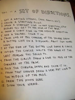
Continuing the This is not a book project, we're on to page 44 - "This is a set of Directions"

My task here was to follow a series of drawing based instructions, like 'draw a dotted line on a diagonal, about 2 inches long' using a drawing implement of my choice. I chose the trusty black biro.


The result is here:


To me it looks a bit like a poorly rendered Alexander Calder sculpture (albeit in biro rather than twisted wire......)

Wednesday, 14 September 2011

This is not a book p.126


Continuing my 'This is Not a Book" adventures by randomly opening the book and doing as I'm told, today I competed page 126 - This is an Underground Organisation.


My task was to go to the "This is Not a Book" webpage, enter the code 'JT25261' and recieve the mission. (You can do it too by clicking here!)


So off I went to my super secret location (I was tempted to imply that I had some sort of secret lair, but sadly I am not a Bond villain from the 1970s). Here is the result!

Mission Acomplished. This post will self destruct in 10 seconds...........


Tuesday, 13 September 2011

Fluorescent Flowers

Continuing with the theme of old(er) projects, I'm going to show you my second attempt at a cross stitched cushion.

Following the Cowboy Cushion I made using the Cath Kidston pattern I decided to have a go at one of the more floral offerings in the book. The one downside to the book (at least for tomboys like me) is the majority of the patterns are floral (the cowboy, sail boat and dog patterns being the exception). I decided to start with the brightest and least traditionally 'girly' of the patterns, and the result is this 'electric flower' cushion!


I backed it using cream embossed velvet fabric salvaged from the mega stockroom clear out at my previous job.


I also had some 'so awful its amazing' fluorescent pink bobble trim which almost matched the pink of the cross stitch so decided to edge the cushion with that. This was a massive pain to attach and I ended up sewing this cushion completely by hand to avoid getting the trim tangled up in the machine. This is something I struggle with (also zips!) so is something I need to work on if I plan on making cushions on a more regular basis.


All in all I am really proud of how this turned out. It is very bright and kitsch and contrasts well against the very 'boysy' background of my house/sofa/living room.

Saturday, 10 September 2011

This is not a book


I was my birthday recently, and I was given a book by Keri Smith called 'This is Not a Book'.


Keri Smith has written a series of books (Wreck this Journal, How to be an Explorer of the World) which are meant to be destroyed/altered by writing on, ripping and experimenting with the pages. Despite this being an awesome idea, I just couldn't bring myself to actually damage the books because, you know, its a book. They're somehow sacred and not to be written on.

But the time has come to take the plunge and start doing as the book is asking me. I decided to come at the book randomly, choose a page by flicking the book open and do what the page tells me to do.

So to page 109 - This is an excerpt from another book.


My randomly selected book is Neverwhere by Neil Gaiman (a book which I strongly reccommend. Far better than the slightly crappy 90s TV series of the same name.)


I close my eyes and flick onto page 275 and write down the first sentence I see:

"He banged the lump of metal with his hammer, twisting it as he did so with implements Richard assumed, correctly, were tongs."


So there we have it, I have started to complete an interactive book project. Stay tuned for the next thrilling instalment!


Hello Cowboy!


So, i'm finally starting the blog I always talked about.

Basically this will be a place to record my craft projects, arty doings and other creative
ramblings. I will also try to highlight other artists/crafters who influence and inspire me, along with any exhibitions, performances etc that I think are worth a mention!

Quick bit of background: Im a double Fine Art graduate (BA and MA) with a love of making - pretty much anything that keeps my hands busy and I'm in! I love sewing, felt, pretentious contemporary art, owls, film, photography, zombies, animation, baking, music, drawing and comics.

I'll kick off with an old project:

My mum bought me "Stitch" by Cath Kidston for christmas last year and I've been stitching non-stop since then. I've always liked Cath Kidston designs, but could never afford the real thing. This is the only way I'd ever be able to have these cushions (and they're handmade - whats not to love!).


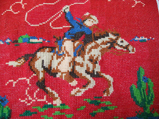
So I started making the 'cowboy' pattern, which is based on this awesome (but very expensive) cowboy pattern:


So heres the finished article! I managed to find some similar 'cowboy' themed fabric in Leeds City market which I mounted the cross-stitched panel onto with some red piping edges and decorative stitiching.

One Ikea cushion pad later and here we are!